

![]()
If you need to type text not in any of the Church Slavonic fonts, but in “citizen”, but in compliance with the norms of the old spelling (with the signs “yat” and “fita”), then you can use free fonts developed by Roman Pavlov: Academy Old, Academy Old Narrow, New Standard Old, New Standard Old Narrow, New Standard Old Narrow Bold, New Standard Unicode. You can also download them on our website.

How can I insert “yat” or “fita” into the text after installing the fonts?
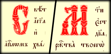
Open the "Insert" section in Word, go to the "Insert Symbol" tab. In the window that opens, select a font containing the letters you need (for example, Academy Old, as shown in the figure below).

Select the letter you need in the list of font characters (for example, capital “yat”), click on the “Keyboard shortcut” button (see the figure above) and assign it.
So, if you have chosen simultaneous pressing of the CTR and Ё keys (CTR + Ё) as a combination for “yat”, pressing them will insert “yat” into your text.
How to install a font on the system?
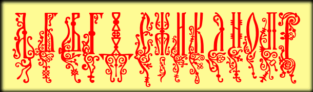
Font set (2002 Andrushchenko N. A.
Spaso-Preobrazhensky Solovetsky stauropegial monastery.e-mail: [email protected]) ; This is a set of fonts designed for the layout of liturgical texts in Church Slavonic.
 |
Fonts are developed in accordance with the requirements of the draft standard
Unified Church Slavonic encoding of 8-bit fonts UCS8
(Unified Church Slavonic Standard).
This set includes the following fonts:
Orthodox.tt Ucs8 - main font.
Orthodox.tt Ucs8 SpacedOut - font with character spacing. Implemented as an "italic style" of the original font.
Orthodox.tt Ucs8 Tight - a font with a dense arrangement of characters.
Orthodox.tt Ucs8 Caps - a font for a set of capitalized headings, i.e. headings consisting of capital letters.
Orthodox.tt Ucs8 Caps SpacedOut- capitalized font with character spacing. Implemented as "italic"
"style" of the capitalized font.
Orthodox.tt Ucs8 Caps Tight - dense capitalized font.
Orthodox.tt eRoos - a font encoded Extended ROOS, i.e. containing Church Slavonic letters arranged according to
ROOS standard, Arabic numerals and special characters
(signs of the Typikon, symbol of the Mark’s Chapter, etc.).
Orthodox.tt eRoos SpacedOut - Extended ROOS encoded font with character spacing. Implemented as an "italic style" of the eRoos font.
Orthodox.tt Ucs8 Drop Caps - a font containing patterned drop caps.
You can download the font package (exe-file 712 kb) from, you can find the latest version of the font package ().

2002 Andrushchenko N. A., Severodvinsk.
For any questions please contact:
[email protected] [email protected] , www.orthodoxy.ru/orthonord , www.arh.ru/~naaA site for those who like to use elegant fonts in Windows (for example, those that imitate handwritten text). We present to your attention quite large collections of fonts - some of them are free, so you can download them from the site and install them in the system, and some are paid, requiring prior purchase.All of them (both paid and free) have a full set of Russian and Latin characters, are compatible with Windows 98/Me/2000/XP and have been tested for performance in popular programs - MS Word XP, Photoshop7, Illustrator10, Corel Draw11.
Basic information
In order to use the Church Slavonic dictionary of the orthodic.org project, you do not have to install Church Slavonic fonts, but it is advisable, as this will reduce traffic and increase the site loading speed. In addition, you will be able to more comfortably use the search for Church Slavonic words.
If you want to translate Church Slavonic words in editor mode, then installing Church Slavonic fonts is simply necessary for you. Without them, working in the Church Slavonic editor is impossible.
In order to install the Church Slavonic font, you first need to download them from here. You can download a package of fonts for work here:
- zip (3.4 MB) - http://www.orthodic.org/files/cs-fonts.zip
- tar.gz (3.4 MB) - http://www.orthodic.org/files/cs-fonts.tar.gz
You can also download fonts from the developer's page. To unpack, you must have the rar unpacker installed. The required minimum is the font "Triodion". Download the "TrueType" type. "Type1" does not need to be downloaded.
Installing fonts on MS Windows systems
- Download the archive with the fonts to some temporary folder.
- Unpack the archive. After unpacking you will receive one or more files with the .ttf extension. These are the font files.
- Launch the "Control Panel" (Start button, Control Panel).
- Launch the "Fonts" icon. If the "Fonts" item is not visible, it may make sense to click on the inscription "Switch to classic view" (on the left). After launching the "Fonts" item, a window will appear with a list of all installed fonts.
- Select the menu item "File" / "Install font...".
- In the window that appears, select the folder where you unpacked the font files. Wait while the system reads the font files and shows their names.
- Select all (or only the ones you need) font names. Click "OK".
Installing Fonts on Linux Systems
- Go to your home folder:
- Create a folder for fonts.fonts, if it does not exist:
- Let's go into it:
- Download the archive with fonts:
- Unpacking the fonts:
- We delete the archive after ourselves:
- Reloading the car
Installing fonts on Mac OS systems
- Unpack the downloaded font archives.
- Close any open applications before installing fonts. New fonts will not appear in some applications if those applications are launched during the font installation process.
- Copy the fonts to the /Library/Fonts/ folder
FONTS
A set of fonts for correct display of texts from our website. Download(743 Kb)
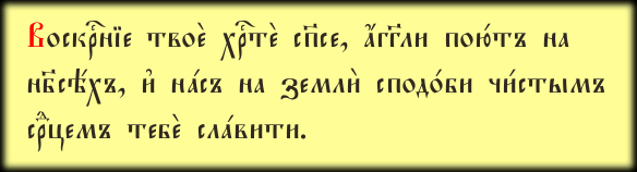
Some of the texts on our site are typed using Church Slavonic and pre-revolutionary Tsarist fonts (texts with “Yatya”). Therefore, in order to correctly display texts from our website, you will need to download and install (for instructions on installing fonts) on your computer necessary minimum fonts (this package contains 4 basic fonts: Royal Times New Roman , Royal Arial , Elizabeth tt Uni (removed upon REQUEST) and Irmologion UCS).
Fonts of the Tsar's spelling
The texts of the Tsarist (pre-revolutionary) spelling from our website were typed usingfont encoding Unicode. Tsarist orthography fonts are fonts containing characters from pre-revolutionary Russian orthography (i.e., the orthography in force in Russia before 1918).
here . .
Standard fonts Unicode (ensure correct display of texts from our website)
|
Arial Unicode MS(included inWindows) |
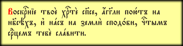
Church Slavonic fonts Church Slavonic texts from our website were typed fromusing encoding fonts UCS8. Below is a collection of the best fonts for this encoding (fonts taken from sites:www.irmologion.ru. And www.orthonord.ru.) We would like to draw your attention to the fact that in order to fully use Church Slavonic fonts, you need to download and install the “Irmologii 4” package, becauseEntering and editing Church Slavonic texts using only a regular keyboard layout is possible, but very difficult. The Irmologii-4 package will allow you to do this much more conveniently and quickly. To familiarize yourself with the design of the fonts below (see what the fonts look like), click here . For instructions on installing fonts, see.
|
Irmologion
The font is based on a typeface from publications of the Synodal Printing House of the early 20th century. The name is taken from the book from which it was redrawn: “Irmology”, 1913 edition. The UCS font is based on the old 13-font collection Irmologion.
This is my first font work, unprofessional and naive. In addition to numerous technical flaws, the font also rather inaccurately reproduces the original typeface. At the time of creating Irmologion, I had neither the experience nor the technical means necessary for high-quality reproduction of the pre-revolutionary font.
Unfortunately, this rather unsuccessful work has become a classic and is used in many user projects, so I am forced to leave Irmologion on the site. If you do not need to maintain compatibility with Irmologion, I recommend using a more successful analogue of the synodal headset - .
Please note: to type text with this and all other UCS fonts, it is strongly recommended to download and install the “Irmology-4” package from the “Programs” section. Entering and editing Church Slavonic texts using only a regular keyboard layout is possible, but very difficult. The "Irmology-4" package will allow you to do this much more conveniently and correctly.
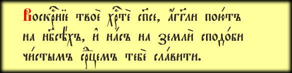
Hirmos
Unlike Irmologion, the Irmos font actually repeats the typeface from the publications of the Synodal Printing House of the early 20th century. (for example, "Irmology" of 1913). This is a remake of my first work (Irmologion), which, like any “first pancake,” is not successful. If you do not need to maintain compatibility with the Irmologion font, use Hirmos: the new font is made more professionally, efficiently and authentically.
Font set characteristics:
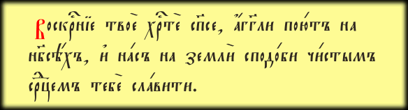
Triodion
This typeface is quite common in publications of the Synodal Printing House of the late 19th and early 20th centuries and, I hope, is best known to today's singers and readers. This typeface contains, for example, modern patriarchal (publishing houses of the Moscow Patriarchate) reprints of both Triodea, the Book of Hours, the Service Book, the Typikon and many other publications.
Font set characteristics:
StaroUspenskaya
The typeface was taken from the Psalter published by the Kiev Pechersk Lavra, presumably from the mid-19th century. In addition to the specific details that make any Kiev-Pechersk typeface recognizable, this font leaves the impression of severity and austerity of the design. When looking at him, frosty Solovki and Valaam come to mind, but... he was born in warm Ukraine.
The compactness of lowercase letters makes it indispensable in musical subtexts, and the beauty of capital letters makes it an excellent candidate for a set of capitalized headings. Although its main purpose, of course, is typing basic text.
Font set characteristics:
Ostrog
The typeface was taken from publications of the second half of the 16th century (printing houses of the cities of Vilna and Ostrog). The creator of the typeface is presumably Pyotr Mstislavets, an East Slavic typographer and associate of the pioneer printer Ivan Fedorov.
Capital letters, in my opinion, don’t really match the rest of the font, and they don’t fit well with each other (but that’s just my personal opinion). The lowercase letters were definitely a success.
Font set characteristics:
Akathistos

The typeface was used in synodal publications of the second half of the 19th and early 20th centuries. The size (point) of the original letters is quite large: the height of the lowercase letters is about 5 mm. This typeface was used to type altar Gospels, large-format editions of akathists, etc.
There is a well-known modern font drawn from the same typeface: Evangelie (Orthodox). My version is redrawn and closer to the original.
Font set characteristics:
Evangelie

Headset from SoftUnion ((C) 1994 SoftUnion Ltd. Created by A. Shishkin and N. Vsesvetskii). I simply recoded it, made the necessary ligatures and added kerning. However, I didn’t try very hard, because on the network there is a much more advanced modification of this typeface for UCS, called Orthodox. I strongly recommend using it, it is designed very high quality. .
The characteristics of this particular option are not particularly impressive:
Pochaevsk
The original typeface was used in liturgical books of the last century, published by the printing house of the Pochaev Lavra. Pochaevsk Ucs was based on its fairly accurate digital version of Pochaevsk. In different font versions there are indications of different designers: Orthodox Information Data Associates (year unknown); Starin, Russian Antiquities, developed by Nikita Simmons (1996); Archbishop John (1999). It can be assumed that the original typeface was produced by OIDA and then redesigned by two other designers.
In Pochaevsk Ucs, I reworked the metrics of many characters, added letter-titles for capital letters, and carefully worked out the kerning.
Feofan
Font from Lenpoligraphmash ((C) AO Lenpoligraphmash, 1994). I just re-encoded it and added kerning here and there. I have never seen a typeface similar to this in old printed publications.
Oglavie
The main, most common heading typeface from pre-revolutionary publications. In printed originals there are many variants of this typeface, differing from each other in small details. The Oglavie font repeats one of them.
Of the modern commercial fonts, Oglavie is most similar to Slavjanic, but is drawn better and differs from it in greater compactness and contrast.
Slavjanic
Unfortunately, the author of the original computer headset is not identified (there is only the year of creation, 1992). I added the missing Church Slavonic letters and title letters there, and worked on the kerning. Several existing symbols were also redone in order to fully correspond to the pre-revolutionary originals.
The font is similar to Oglavie, but is of lower quality and has different proportions and contrast. It is posted here for compatibility purposes: for a long time, Slavjanic was the only font of this type available in the Ucs8 encoding. Slavjanic is recommended to be used if you already have text laid out in this font. Otherwise use Oglavie.
Kathisma
A fairly common heading typeface from pre-revolutionary publications of the 18th - 20th centuries.
There is a fairly well-known commercial font, Psaltyr, reproduced from the same printing samples as Kathisma. There are few differences: the letters Kathisma are slightly wider, but the distances between letters are smaller; some letters are drawn differently; The kerning has been worked out more carefully.
I will not hide that the main goal of developing a font similar to an existing one from scratch is to create a free, non-commercial version that reproduces a rather beautiful pre-revolutionary typeface.
The encoding is the same as in capital fonts.
Psaltyr
The designer of the original digital font is Nikita Vsesvetskii ((C) SoftUnion Ltd., 1994. Created by N.Vsesvetskii). The font has its own analogue in pre-revolutionary publications. True, the author of the digital version slightly changed the proportions of the letters (in relation to the original typeface, the letters in the font are elongated vertically by 20-30 percent) and, on the contrary, pushed the superscripts up and compressed them (in the original font, the superscripts feel more free). Without taking into account these two points, as well as some small simplifications in the design of letters, the digital font is a fairly accurate copy of the original pre-revolutionary one.
Strictly speaking, the original Psaltyr font is commercial. There is a free version of this font - . The Psaltyr Ucs font is posted on this site for compatibility purposes: for a long time, Psaltyr was the only font that reproduces this beautiful pre-revolutionary prototype. Psaltyr Ucs is recommended to be used if you already have text laid out in this font. Otherwise use Kathisma.
Zlatoust
The idea for the typeface was taken from the spine of a pre-revolutionary liturgical collection. The missing letters are recreated in the general style. The design of the letters is related to the handwritten script of the 15th-16th centuries, but does not have serifs or “knots” on the lines of the letters.
The font is suitable for designing various types of headings. Enabling kerning is highly desirable, since the design of the letters suggests this. The encoding is the same as in capital fonts.
Posad
Another decorative font suitable for headings. Similar to Zlatoust, but with serifs and knots. Enabling kerning is highly desirable. The encoding is the same as in capital fonts.
Indycton
Typeface for initial letters. Copied by me from pre-revolutionary publications. There are all the letters, even those that are not found in the form of drop caps. The contours are quite complex, which can strain rasterizers. I had to invent about a third of the letters myself, since I was unable to find their early printed originals due to the rare statistical frequency of using these letters as the initial beginnings of texts.
The font encoding is the same as in capital fonts, but to use it in the design of drop caps it is better to use a special add-on available in the Irmologii-4 package.
Vertograd
Another letter font. The typeface was quite common in pre-revolutionary publications. Not all letters are available yet, but the font can be used. Unlike the Indycton typeface, the letters of this font have many common elements and lines, therefore, without forgetting about the measure, the font is quite appropriate to use for typing entire words and heading phrases. There is no kerning for this yet, but it is expected.
Let me remind you that to design initial letters it is better to use a special add-on available in the Irmologii-4 package.
Bukvica
The author of the font is Konstantin Spektorov. The font reproduces the initial letters from the winter (1642) and summer (1643) parts of the Prologue. Initial letters of this type were widely used in publications of the Moscow Printing House in the 17th century.
The font is intended to be used only for drop caps. This determines some restrictions in the composition of letters and symbols. There are all the letters, except for “uka ligature”, b, ы, b. Of the superscripts, only oxia, zvatelso and iso are present. There are no punctuation marks. Kerning only takes into account the combination of some vowels with the caller and "iso".
All fonts are packaged using the WinRAR archiver. You can download the latest version of WinRAR on the manufacturer’s website: www.rarlab.com.
Old fonts
I provide my old fonts here only for compatibility. There are probably quite a few documents typed by the old Irmologion, which for some reason you don’t want to convert, bringing them to the new Irmologion Ucs (the converter is included in the “Irmologion-4” package, available in the “Programs” section). To be able to read such documents, you can download the old Irmologion here. Fonts from this section are no longer supported. If instead of letters, squares glow on the screen, if the upper parts of the letters are not visible, it is better to convert such text into a new UCS font. The converter is designed in such a way that it “pulls out” text even from most cases of “squares and questions”, while sparing the layout.
Irmologion-2
13-font collection, typesetting template and documentation. There are two options: one that works in Word 95-97 and PageMaker, and one that works in Word 97-2000. Choose one. Both sets cannot be installed at the same time. The font is obsolete and no longer supported, replaced by . I repeat:
font not supported!
We kindly ask you not to send letters with requests to correct superscripts that are cut off in new systems, complaints about “squares”, etc. The fonts are not posted for use in serious work, but in order to somehow read old texts and convert them into new fonts using converters (and similar).
Old Indycton
Old letter font. The font is obsolete and no longer supported, replaced by .
In my opinion, today there are no generally accepted fonts that allow you to work correctly, beautifully and, most importantly, conveniently with Church Slavonic texts. Here are some of those that we were able to find on the Internet. To install any of them on your computer, perform a number of simple operations:1. Save the archive file I suggested on your disk (double-click on the link).
2. Unpack it using for example WinRar or WinZip.
3. In the Start menu - Settings - Control Panel, open the "Fonts" folder.
4. Click the File menu - Install font and specify the path to the unpacked file.
5. After installation, you can safely use this font in text editors (for example, Word).
6. Some archives may contain several files; in this case, see the readme file for instructions on installing fonts.
1. Fonts
- The "Irmologion" font group (311 kb) also contains a *.dot template for working in Word /author-Vladislav Dorosh/
- Another version of the font "Izhitsa" (30 kb)
- Another version of the font "Cyrillic" (38 kb)
- Another font "Cyrillic" (39 kb)
- Font group "Orthodox" (137 kb)
- Font "Church Slavonic" (79 kb)
- Font "Anastasia" (55 kb) Some scores in *.pdf format, posted in the *Kliros* section, were created unprofessionally, so the fonts are displayed incorrectly. If you encounter this problem, try installing the font "Anastasia", which is responsible for displaying notes and musical notations.
- Fonts "SchoolBook" and "AG_Garamond" (193 kb) These fonts were used in the scores of the Moscow Regency Singing Seminary. The authors obviously haven't fully figured out how to create pdf documents, so the fonts are not displayed in their scores. Download this archive and install the fonts.